UX / UI DESIGN

User Interface (UI) and User Experience (UX) design is a combination of science and art.
Your website or software can’t just be beautiful. It needs to be functional and optimized for the end user.
A UI UX Designer can turn an ordinary shopping cart into a selling machine by focusing on how the user goes from landing on the product page, viewing the images and layout of the action buttons, and tweaking the flow of the checkout process to be easy, simple, and efficient.
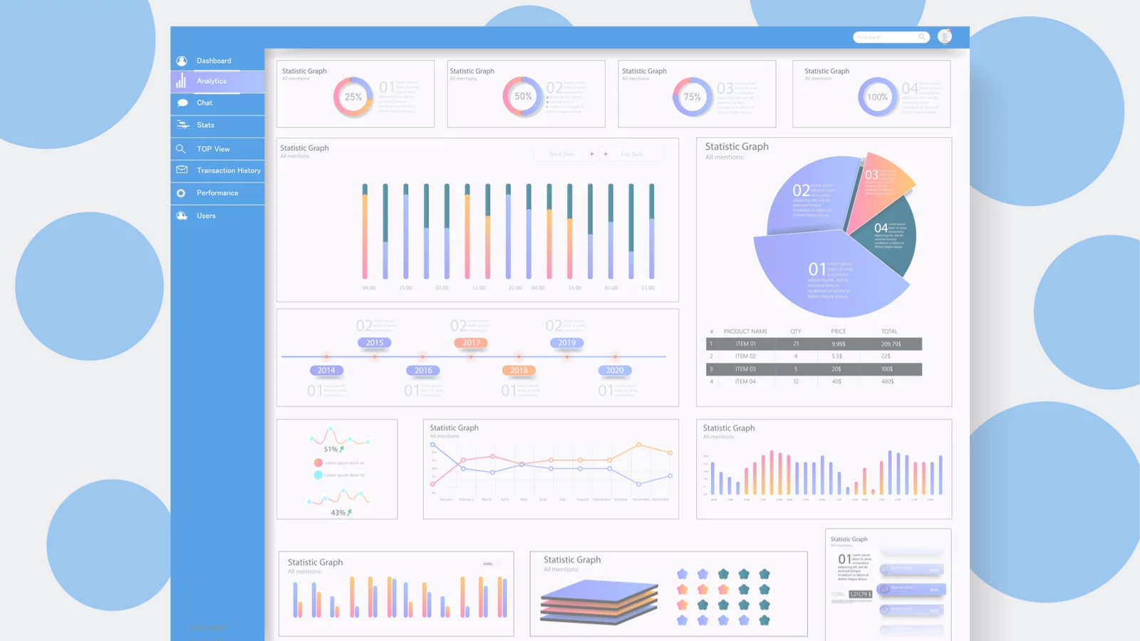
Dashboards, checkouts, landing pages and forms, mobile apps… every bit of software we create benefits from our UI UX experience.
What is User Interface Design?
UI Design focuses on understanding what a user wants to do with an interface and ensuring the interface has the proper elements to allow the user to easily do what they need to.

The space between elements on a page, called white space or negative space, can be just as important is helping users determine how to use a system and make it more pleasant to use.
Users expect to find things they need right away. Too much scanning of a page creates a negative experience.
Properly spacing items is an important way to make scanning simple and finding the necessary elements to perform their desired task less of a chore.


We’ll probably use this word A LOT.
Keeping an interface simple is crucial to a positive experience for users. Too much clutter or gimmicky design features detract from the ultimate goal: to help the user to perform the task they desire with your system.
By keeping an interface simple, it will be easier for them to find what they're looking for, understand the task they should perform, and will give you better conversion rates overall.


We all want to stand out and have a system that is innovative. Don’t fall back on your design to provide that innovation. Let the system speak for itself.
Users don’t want to work to find what they’re looking for or need to learn a new way to use a common feature. By staying consistent to common interface design trends, you’re making the users’ life easier and making your system easier to use.
Sometimes, being highly efficient is the best way to stand out.

We can direct the users eyes to specific elements by properly using color and typography.
For example, by keeping all buttons in a system the same bright color, we can help users see where they can take action.
In the same way, by using larger and smaller text, we can help users read headers that give them a summary of a section, and smaller text to explain a section in more detail. This facilitates scanning on the page and allows them to quickly find the section they are looking for.

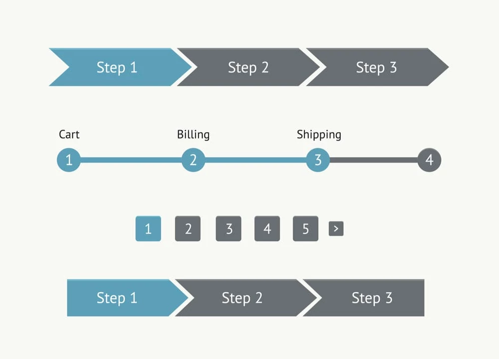
A user’s path through your system should be clearly marked for them, like Hansel and Gretel marked theirs in the woods with breadcrumbs. This is why a clickable path on a user interface is called a breadcrumb or breadcrumb trail.
You don’t want a user to get frustrated and give up. Your interface should clearly inform the user of where they have been, and what action they should take next.
In the same way, we expect some level of user error and design a system with help aids or corrections for common mistakes users will make. No user left behind is our motto.


