If you are thinking of freshening up your website or getting a new one in 2016, here are some of the main trends to keep in mind.
In this first part of Web Design Trends in 2016 series, I’ll cover the basic trends you can expect to see now and in the coming year.
Over the next few parts of this series, I’ll talk about each trend in a little more detail. Watch for the next posts, one each week.
Not getting them in your inbox? Just click the Free Tips button in the top right and fill out your email to get a weekly digital marketing tip. Its free and only once a week—how can you turn that down?
And now…
6 Web Design Trends for 2016:
Mobile.
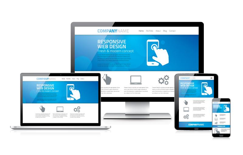
Now that mobile browsing has surpassed computer access to the Internet, you should have a website designed for mobile and computer screens. Responsive design is still the preferred choice, and is recommended by Google, to provide the best user experience and search engine optimization (SEO). The result is that many websites end up having a similar appearance as elements are rearranged for mobile.
Is this bad? No, particularly not when you’re on a mobile device with limited screen size. Being able to quickly find what you’re looking for is a huge advantage and will help your mobile site be a hit with users.
Familiar is good.
We all want our website to stand out. To be cutting-edge and original. Just remember that some level of familiarity is good. You want your users to know how to use your site and where to look to quickly find what they need.
A site that follows a similar UI (user interface) pattern to many other sites is actually a good thing. Internet users have grown accustomed to certain placements of website features, and keeping those things consistent will give your visitors a better user experience. Remember, a great user experience is your ultimate goal.
A great design will speak to your audience within the first few seconds, giving them the emotional connection to your company necessary to build trust and make a sale.
Movement
Nothing attracts the eye like movement. Even the simplest of animations, like a twinkling on a button, can boost page interaction and conversions. From the more complex parallax scrolling to simple animations like hovers and loading animation, movement can make your visitor’s experience a better one.
Interactions
At some point, you want visitors to interact with your website, whether that be to Like your business on Facebook through your widget, click on the star rating of a product, playing a video, hovering to learn more, zooming in on a product, or any other “microinteraction”. These tiny interactions with your website are crucial to building trust and leading to a conversion (a sale or form fill).
Keep your points of interaction simple, familiar, and intuitive to users.
Flat Design
Despite its sudden popularity, flat design is not just some fly-by-night trend. It’s a substantial approach to Web design that’s rooted in practicality, and necessity.
Flat designs use 5 key elements: long shadows, simple typography, ghost buttons, bright color palettes, and minimalism. This combines to create design that is easy on the eye, and helps the user quickly find what they are looking for.
In today’s digital world, simple is better. We’re inundated all day with digital signals and we are constantly connected to the Web. By keeping a design flat, we’re offering viewers much-need calm after stimulation overload.
Material Design
Last year, Google launched its new style language, Material Design. It uses shadow effects and the concepts of movement and depth in order to create designs that appear more realistic to the user. This design concept shares a lot in common with Flat Design in its minimalist approach and emphasis on UI, but allows for more variation in shadows and depth.
Have you noticed any web design trends I failed to mention? Share them in the comments! And don’t forget to watch for the rest of the series by joining our Free Tips mailing list!


