How to avoid a high website bounce rate.
The longer a visitor stays on your website, the more likely
they are to contact you or buy from you.
Turning a visitor into a customer is the goal of most websites. So how can you keep your visitors on your website longer?
Avoiding the design pitfalls that lead to website
abandonment is one important way to keep users on your website longer
and turn them into customers.
How to reduce website bounce rates:
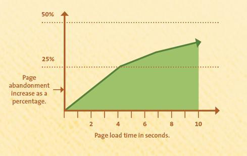
- Optimize your site loading time. To keep a user on your site, they first
have to actually GET to your site successfully. With each additional second it
takes your site to load, more people have given up and gone on to another site. Don't lose the battle because of site loading time. Web users have very limited attention spans, so make sure your site is
optimized to load quickly. How? Use a good hosting company and avoid
websites bogged down with fancy flash, widgets, and third-party tools.
- Avoid a confusing or cluttered layout. First impressions matter ,
so make sure your site is simple and to the point. Avoid distractions,
like pop ups or ads that might have users clicking away. Also consider your audience. For example, if people at work are the most
likely to be visiting your site, having loud audio is a sure way to get them
clicking away as quickly as possible so their cubicle neighbor doesn't know
they are on your site.
- Communicate your value within the first 10 seconds. According
to major computer human interaction research, 99% of websites have a negative
aging affect. Basically, this means that
visitors are most likely to leave in the first seconds, but as time passes,
they are less likely to leave. It's rare
for people to linger on Web pages, but when users do decide that a page is
valuable, they may stay for a bit. Most
users with leave within the first 10 seconds. To gain several minutes of user
attention, you must clearly communicate your value proposition within 10
seconds.
- Include an action item. Tell your visitors what to do, and
they will be more likely to continue on your site. Buttons that are well
designed, stand out, and clearly indicate where they go will get your visitors
to click more into your site, rather than clicking away to a new site. Action
items like 'Sign Up for a Free Trial'Â, 'Get Your Coupon'Â, 'Start Shopping'Â, 'Get
a Free Quote'Â, 'Buy Now' and 'Get Free Shipping'Â, or even'Sign Up for our
Newsletter'Â all encourage your visitors to take action.
- Navigation that makes sense. Make sure your visitors can
find what they are looking for immediately. Include a search bar. Make your navigation bar visible, simple, and
include the main pages of your site. Distracting but necessary items, like
privacy policies and terms, are best left to the bottom navigation (footer) of
your site. Use anchor text to send users to the correct part of a page so they
don't have to scroll. Finding the item or information they were searching for
in the first place is a priority, and if they can't immediately see how to get
to the information they want, a user is likely to leave the site and look
elsewhere.
- Website abandonment has lasting effects. If someone leaves your site
because of a bad experience like errors, poor site design, or slow loading
time, they will probably never return.
And they may also tell others about their bad experience.
Ecommerce checkout abandonment has another set of rules to
follow, so if you're selling a product, be sure your checkout process is
optimized. Here are some great ways to
avoid checkout abandonment.
Need some help optimizing your site and avoiding a high website bounce rate? You're in the right place!
