Every year, I like to take a look at the changing trends in web design. Some web design trends have stuck around longer than I would have predicted (parallax scrolling) while others are still here because they just make sense, like horizontal scrolling.
Some design trends, such as "scrollytelling", can be effective but also require extra work to create and won’t make sense for every site. While other web design trends, like oversized text, help users read the most important things first and immediately get the message your website is sharing.
For the past several years, we’ve seen a continued move towards all things mobile. Web Design trends that make mobile browsing easier and more enjoyable are the trends that have grown in popularity.
What are top web design trends for 2022?
1) Big Typography
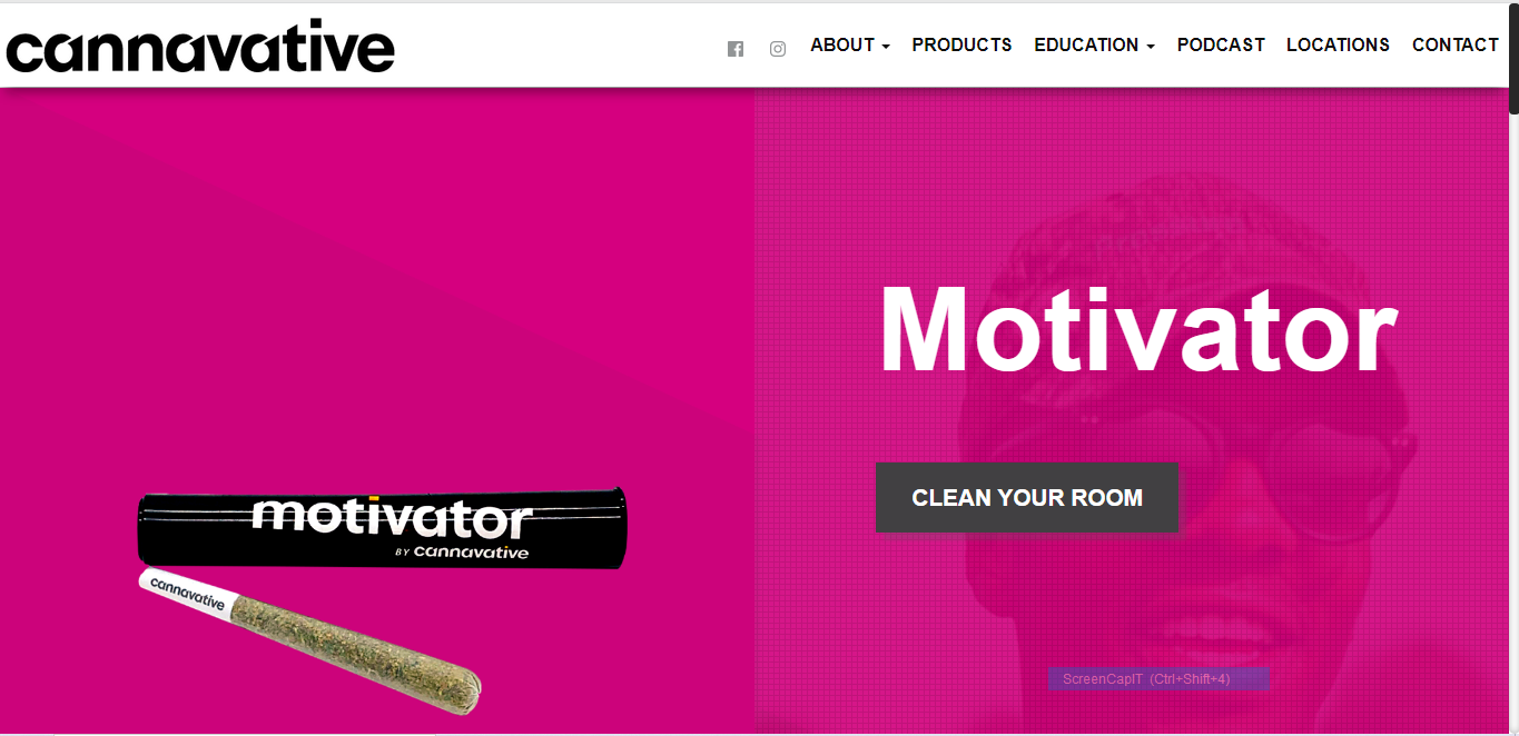
You can’t mess around if you want to grab website visitors’ attention. Strong typography is the easiest way to grab the eye and convey your message quickly.
The traditional “hero image” is being replace by “hero headers”. Large, isolated text that immediately sends your brand’s message to website visitors.
2) Emphasize Products
Just like large, bold typography grabs attention, isolated product images put attention on where it should go – on your products.
Using the same example of Cannavative above, the combination of bold text and isolated, large product image makes the product the hero of the page.
And isn’t that how it should be?
Your customers are coming to buy your products, and you want to put them in their best light. So jump on this trend bandwagon if you’re selling products through your website. Make your products the hero by using professional product images, isolating them on the page, and keeping the background simple.
3) Single Page Websites
The infinite scroll is how most people prefer to browse. Single page websites are the easiest way for mobile users to get the best user experience. They can continue to scroll down to get the information they are looking for. Or, like many new websites, navigation can also be used to quickly bring the user down to an anchor at a specific location on the long page.
The downside of a single page website is that it often doesn’t give search engines much content to pull from when ranking your website. That is when a footer linking to lots of additional content comes in handy. It keeps your website clean and easy to navigate, while also providing search engines everything they need for SEO.
4) Neutral Hues
The bold, vibrant colors of recent years are now giving way to more subdued color schemes.
“When it comes to branding, I think we will see everything begin going to a more neutral tone overall. Brands will begin embracing a softer feel, rather than the loud 80s vibe from last year,” says ApogeeINVENT Creative Director Andrew Frey.
Now that you know the trends, what should you do about them for YOUR business website?
Design changes from year to year. Nothing moves as fast as the Internet. And web design is one area that we see constant change.
You don’t have to jump on every new trend for your website design. But there are advantages to having an updated design:
Users like a similar experience across website.
Staying up-to-date on trends also means the experience of your users will match most other websites they use frequently. People on your website are happier when it is easy-to-use, and familiar.
Trends rise from new tech
As problems that users face are solved by developers, the experience of website users is improved. These become trends.
For example, horizonal scrolling is back, and is one of the best ways to show off details of topics / categories while still allowing users the vertical scroll to jump between topics. The increasingly prevalence of browsing from mobile makes these type of features essential.
And while we’re talking about mobile, we should the rise of the single page website. Yup, long form single page websites are back and more popular than ever, driven by our insatiable urge to scroll.
Newsfeeds, Netflix; these have all trained us to just keep scrolling down to get more content.
Trends let your brand stand out.
“Scrollytelling” is a cutesy buzz term used to describe the combination of the importance of storytelling with the growing popularity of interactive elements in a website. But this trend creates a memorable experience for users. This helps you stand out from the millions of other websites available.
Search algorithms update regularly
Don’t forget about the business side of design. You need users to FIND your site before they can appreciate your beautiful, trendy design. If you want to keep your website showing up in search results, you need to make sure it is following search standards.
Companies like Google update their search algorithms regularly, and that means you need to have a website that is up-to-date to avoid penalties. Fast-loading, mobile, and fresh content are all keys to staying on the algorithm’s good side.
Don’t want to worry about the technical side of your website? Find a service that does all the dirty work for you, like
ApogeeSITES’ website concierge service. Not everyone wants to read the developer notes for every algorithm update, so hire the company that will do it for you.
These are just a few of the trends your website should include to best connect with your audience. Regular design upgrades are important to stay ahead of your competition and look relevant to website visitors.
Want to talk more about upgrading your website design and getting some SEO / Content help from professionals? It’s all included in our Website Concierge Packages.
Talk to us today!


